
Arcade Ribbon Start Menu Style for Windows 11
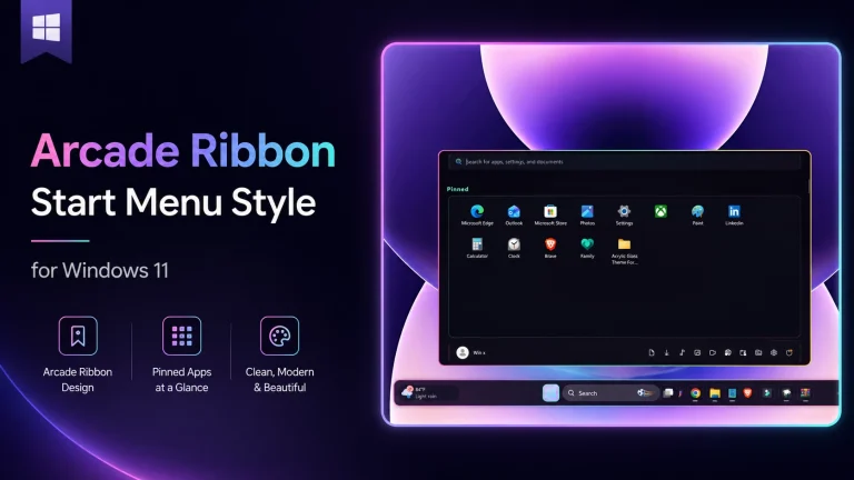
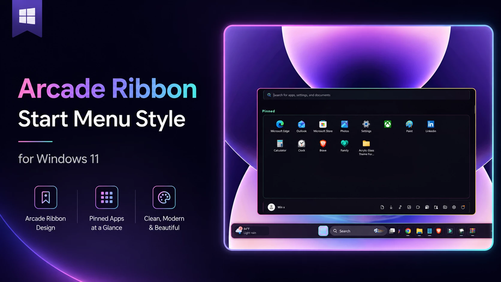
The Arcade Ribbon Start Menu Style For Windows 11 gives the standard Start menu a colorful and gaming-inspired appearance. It is designed for users who want something more energetic than the default Windows 11 layout while keeping their pinned apps and common controls easy to access.
This Arcade Ribbon Start Menu Style for Windows 11 is intended for use with a compatible Windows 11 Start Menu Styler mod through Windhawk. It focuses on changing the visual appearance of the Start menu, including its background, app sections, buttons, spacing, rounded corners and decorative accents.
The Arcade Ribbon design can work especially well with gaming wallpapers, RGB desktop setups, colorful icon packs and futuristic taskbar styles.
What Is This Windhawk Style?
The Arcade Ribbon Start Menu Style is a custom visual configuration for the Windows 11 Start menu. It uses Windhawk styling rules to change how supported Start menu elements appear without replacing the normal Windows shell.
The main purpose of the style is to make the Start menu feel more personal and visually interesting. Your pinned applications, search controls, account area and power options remain familiar, but their presentation receives a more polished arcade-inspired design.
This Arcade Ribbon Start Menu Style for Windows 11 customization changes appearance rather than adding new Windows features. The exact result may vary depending on your Windows build, Start menu layout and the version of the required Windhawk mod.
Design Overview
The Arcade Ribbon style uses a modern gaming-inspired visual direction. Its design may include a dark background combined with bright accent colors such as blue, purple, cyan, pink or red.
Ribbon-style decorative elements help separate different parts of the Start menu. These accents can make the pinned-app section, recommendation area and lower control bar feel more organized.
Rounded corners are used to match the visual language of Windows 11. App buttons and menu sections may also receive soft outlines, subtle shadows or highlighted hover effects.
The dark base helps colorful icons remain visible, while brighter accents create an arcade-like appearance without making the Start menu difficult to read.
Depending on the supplied style configuration, the design may also include:
- Colorful ribbon-shaped highlights
- Dark translucent backgrounds
- Rounded app-button containers
- Bright selected and hover effects
- Improved spacing between Start menu sections
- Custom borders around supported panels
Key Features
- Custom Windows 11 Start menu appearance
- Designed for Windhawk mod customization
- Modern arcade and gaming-inspired design
- Ribbon-style visual accents
- Rounded panels and app buttons
- Colorful hover and selection effects
- Clean and organized Start menu layout
- Works well with matching themes and icons
- Suitable for dark and RGB desktop setups
- Keeps familiar Windows Start menu functions
- Download and install Windhawk
- Open Windhawk and install the Windows 11 Start Menu Styler mod
- Go to the Advanced tab
- Paste the provided configuration code into the “Mod settings” box
- Click Save to apply the style
- For more details, visit this GitHub guide
- Windahwk Style more Windahwk Style
{ "disableNewStartMenuLayout": "forceNewLayout", "styleConstants[0]": "MenuBackground=<WindhawkBlur BlurAmount=\"22\" TintColor=\"#08060F\" TintOpacity=\"0.95\" TintLuminosityOpacity=\"0.08\" TintSaturation=\"0.90\" NoiseOpacity=\"0.015\" NoiseDensity=\"1.0\" FallbackColor=\"#FC08060F\" />", "styleConstants[1]": "HeaderSurface=<LinearGradientBrush StartPoint=\"0,0\" EndPoint=\"1,0\"><GradientStop Color=\"#F0151024\" Offset=\"0\" /><GradientStop Color=\"#F00B1720\" Offset=\"0.50\" /><GradientStop Color=\"#F0180D20\" Offset=\"1\" /></LinearGradientBrush>", "styleConstants[2]": "GridSurface=<LinearGradientBrush StartPoint=\"0,0\" EndPoint=\"0,1\"><GradientStop Color=\"#E80E0B18\" Offset=\"0\" /><GradientStop Color=\"#F0080711\" Offset=\"1\" /></LinearGradientBrush>", "styleConstants[3]": "DockSurface=<SolidColorBrush Color=\"#F0120D1C\" />", "styleConstants[4]": "TileSurface=<SolidColorBrush Color=\"#991D1730\" />", "styleConstants[5]": "TileHover=<SolidColorBrush Color=\"#D72C2541\" />", "styleConstants[6]": "TilePressed=<SolidColorBrush Color=\"#F03C3152\" />", "styleConstants[7]": "TileSelected=<SolidColorBrush Color=\"#B02A4B45\" />", "styleConstants[8]": "NeonMint=<SolidColorBrush Color=\"#FF70FFBF\" />", "styleConstants[9]": "NeonPink=<SolidColorBrush Color=\"#FFFF5BB8\" />", "styleConstants[10]": "NeonGold=<SolidColorBrush Color=\"#FFFFD166\" />", "styleConstants[11]": "TextPrimary=<SolidColorBrush Color=\"#FFF4F0FF\" />", "styleConstants[12]": "TextMuted=<SolidColorBrush Color=\"#FFB6ADCA\" />", "styleConstants[13]": "SoftBorder=<SolidColorBrush Color=\"#665E4D77\" />", "styleConstants[14]": "MenuBorder=<LinearGradientBrush StartPoint=\"0,0\" EndPoint=\"1,0\"><GradientStop Color=\"#FFFF5BB8\" Offset=\"0\" /><GradientStop Color=\"#FF70FFBF\" Offset=\"0.50\" /><GradientStop Color=\"#FFFFD166\" Offset=\"1\" /></LinearGradientBrush>", "styleConstants[15]": "PanelBorder=<LinearGradientBrush StartPoint=\"0,0\" EndPoint=\"1,1\"><GradientStop Color=\"#8870FFBF\" Offset=\"0\" /><GradientStop Color=\"#555E4D77\" Offset=\"0.52\" /><GradientStop Color=\"#88FF5BB8\" Offset=\"1\" /></LinearGradientBrush>", "styleConstants[16]": "MenuCornerRadius=14", "styleConstants[17]": "PanelCornerRadius=10", "styleConstants[18]": "TileCornerRadius=7", "styleConstants[19]": "SearchCornerRadius=8", "styleConstants[20]": "BorderSize=1", "styleConstants[21]": "MenuBorderSize=2", "controlStyles[0].target": "Grid#MainMenu", "controlStyles[0].styles[0]": "Width=980", "controlStyles[0].styles[1]": "Background=Transparent", "controlStyles[1].target": "Grid#FrameRoot", "controlStyles[1].styles[0]": "MinHeight=570", "controlStyles[1].styles[1]": "MaxHeight=570", "controlStyles[1].styles[2]": "Margin=0", "controlStyles[1].styles[3]": "Padding=0", "controlStyles[2].target": "Grid#MainContent", "controlStyles[2].styles[0]": "Background=Transparent", "controlStyles[2].styles[1]": "Margin=0", "controlStyles[3].target": "StartMenu.SearchBoxToggleButton", "controlStyles[3].styles[0]": "Width=920", "controlStyles[3].styles[1]": "Height=48", "controlStyles[3].styles[2]": "HorizontalAlignment=Center", "controlStyles[3].styles[3]": "Margin=0,12,0,10", "controlStyles[4].target": "StartMenu.SearchBoxToggleButton > Grid@CommonStates > Border#BorderElement", "controlStyles[4].styles[0]": "Background@Normal:=$HeaderSurface", "controlStyles[4].styles[1]": "Background@PointerOver:=$TileHover", "controlStyles[4].styles[2]": "Background@Pressed:=$TilePressed", "controlStyles[4].styles[3]": "Background@Checked:=$HeaderSurface", "controlStyles[4].styles[4]": "Background@CheckedPointerOver:=$TileHover", "controlStyles[4].styles[5]": "Background@CheckedPressed:=$TilePressed", "controlStyles[4].styles[6]": "BorderBrush@Normal:=$SoftBorder", "controlStyles[4].styles[7]": "BorderBrush@PointerOver:=$NeonMint", "controlStyles[4].styles[8]": "BorderBrush@Pressed:=$NeonPink", "controlStyles[4].styles[9]": "BorderBrush@Checked:=$NeonMint", "controlStyles[4].styles[10]": "BorderThickness=$BorderSize", "controlStyles[4].styles[11]": "CornerRadius=$SearchCornerRadius", "controlStyles[4].styles[12]": "BackgroundTransition:=<BrushTransition Duration=\"0:0:0.09\" />", "controlStyles[5].target": "Grid@SearchBoxInputStates > Border#TaskbarSearchBackground", "controlStyles[5].styles[0]": "Background@NoFocus:=$HeaderSurface", "controlStyles[5].styles[1]": "Background@SearchBoxHover:=$TileHover", "controlStyles[5].styles[2]": "Background@ActiveInput:=$TileHover", "controlStyles[5].styles[3]": "BorderBrush:=$NeonMint", "controlStyles[5].styles[4]": "BorderThickness=$BorderSize", "controlStyles[5].styles[5]": "CornerRadius=$SearchCornerRadius", "controlStyles[5].styles[6]": "BackgroundTransition:=<BrushTransition Duration=\"0:0:0.09\" />", "controlStyles[6].target": "StartMenu.PinnedList#StartMenuPinnedList", "controlStyles[6].styles[0]": "Width=924", "controlStyles[6].styles[1]": "MinHeight=370", "controlStyles[6].styles[2]": "MaxHeight=390", "controlStyles[6].styles[3]": "Height=Auto", "controlStyles[6].styles[4]": "HorizontalAlignment=Center", "controlStyles[6].styles[5]": "Margin=0,0,0,4", "controlStyles[7].target": "StartMenu.PinnedList#StartMenuPinnedList > Grid#Root", "controlStyles[7].styles[0]": "Background:=$GridSurface", "controlStyles[7].styles[1]": "BorderBrush:=$PanelBorder", "controlStyles[7].styles[2]": "BorderThickness=$BorderSize", "controlStyles[7].styles[3]": "CornerRadius=$PanelCornerRadius", "controlStyles[7].styles[4]": "Padding=8,6,8,8", "controlStyles[8].target": "GridView#PinnedList > Border > ScrollViewer", "controlStyles[8].styles[0]": "Padding=10,4,10,10", "controlStyles[8].styles[1]": "Margin=0", "controlStyles[8].styles[2]": "ScrollViewer.VerticalScrollMode=2", "controlStyles[8].styles[3]": "ScrollViewer.VerticalScrollBarVisibility=1", "controlStyles[9].target": "GridView#PinnedList > Border > ScrollViewer > Border#Root > Grid > ScrollContentPresenter > ItemsPresenter > ItemsWrapGrid", "controlStyles[9].styles[0]": "Margin=10,2,10,10", "controlStyles[9].styles[1]": "MaximumRowsOrColumns=8", "controlStyles[10].target": "TextBlock#PinnedListHeaderText", "controlStyles[10].styles[0]": "Margin=18,7,0,8", "controlStyles[10].styles[1]": "FontSize=16", "controlStyles[10].styles[2]": "FontWeight=Bold", "controlStyles[10].styles[3]": "Foreground:=$NeonMint", "controlStyles[10].styles[4]": "CharacterSpacing=80", "controlStyles[11].target": "Grid#AllListHeading", "controlStyles[11].styles[0]": "Margin=10,3,10,4", "controlStyles[12].target": "Grid#AllListHeading > TextBlock#AllListHeadingText", "controlStyles[12].styles[0]": "Margin=10,2,0,3", "controlStyles[12].styles[1]": "FontSize=14", "controlStyles[12].styles[2]": "FontWeight=SemiBold", "controlStyles[12].styles[3]": "Foreground:=$NeonGold", "controlStyles[13].target": "Grid#AllListHeading > Microsoft.UI.Xaml.Controls.DropDownButton#ViewSelectionButton", "controlStyles[13].styles[0]": "Margin=0,0,8,0", "controlStyles[14].target": "Microsoft.UI.Xaml.Controls.DropDownButton > Grid@CommonStates", "controlStyles[14].styles[0]": "Background@Normal:=$TileSurface", "controlStyles[14].styles[1]": "Background@PointerOver:=$TileHover", "controlStyles[14].styles[2]": "Background@Pressed:=$TilePressed", "controlStyles[14].styles[3]": "BorderBrush@Normal:=$SoftBorder", "controlStyles[14].styles[4]": "BorderBrush@PointerOver:=$NeonGold", "controlStyles[14].styles[5]": "BorderBrush@Pressed:=$NeonPink", "controlStyles[14].styles[6]": "BorderThickness@Normal=$BorderSize", "controlStyles[14].styles[7]": "BorderThickness@PointerOver=$BorderSize", "controlStyles[14].styles[8]": "BorderThickness@Pressed=$BorderSize", "controlStyles[14].styles[9]": "CornerRadius=$TileCornerRadius", "controlStyles[14].styles[10]": "Padding=10,4,8,4", "controlStyles[15].target": "Windows.UI.Xaml.Controls.Grid#TopLevelSuggestionsListHeader", "controlStyles[15].styles[0]": "Visibility=Collapsed", "controlStyles[16].target": "Windows.UI.Xaml.Controls.Grid#NoTopLevelSuggestionsText", "controlStyles[16].styles[0]": "Visibility=Collapsed", "controlStyles[17].target": "Grid#TopLevelSuggestionsContainer", "controlStyles[17].styles[0]": "Visibility=Collapsed", "controlStyles[18].target": "Grid#TopLevelSuggestionsRoot", "controlStyles[18].styles[0]": "Visibility=Collapsed", "controlStyles[19].target": "GridView#RecommendedList", "controlStyles[19].styles[0]": "Visibility=Collapsed", "controlStyles[20].target": "Grid#MoreSuggestionsRoot", "controlStyles[20].styles[0]": "Visibility=Collapsed", "controlStyles[21].target": "Button#ShowMoreSuggestionsButton", "controlStyles[21].styles[0]": "Visibility=Collapsed", "controlStyles[22].target": "Button#HideMoreSuggestionsButton", "controlStyles[22].styles[0]": "Visibility=Collapsed", "controlStyles[23].target": "Grid#NavPanePlaceholder", "controlStyles[23].styles[0]": "Width=924", "controlStyles[23].styles[1]": "Height=56", "controlStyles[23].styles[2]": "HorizontalAlignment=Center", "controlStyles[23].styles[3]": "Margin=0,4,0,12", "controlStyles[23].styles[4]": "Padding=10,4,10,4", "controlStyles[23].styles[5]": "Background:=$DockSurface", "controlStyles[23].styles[6]": "BorderBrush:=$MenuBorder", "controlStyles[23].styles[7]": "BorderThickness=$BorderSize", "controlStyles[23].styles[8]": "CornerRadius=$PanelCornerRadius", "controlStyles[24].target": "StartDocked.NavigationPaneView#UserControl > Grid#RootPanel", "controlStyles[24].styles[0]": "Background=Transparent", "controlStyles[24].styles[1]": "FlowDirection=0", "controlStyles[25].target": "StartDocked.PowerOptionsView#PowerButton", "controlStyles[25].styles[0]": "FlowDirection=0", "controlStyles[26].target": "ItemsStackPanel > ListViewItem", "controlStyles[26].styles[0]": "FlowDirection=0", "controlStyles[27].target": "StartDocked.NavigationPaneButton > Grid@CommonStates > Border#BackgroundBorder", "controlStyles[27].styles[0]": "Background@Normal=Transparent", "controlStyles[27].styles[1]": "Background@PointerOver:=$TileHover", "controlStyles[27].styles[2]": "Background@Pressed:=$TilePressed", "controlStyles[27].styles[3]": "BorderBrush@PointerOver:=$NeonMint", "controlStyles[27].styles[4]": "BorderBrush@Pressed:=$NeonPink", "controlStyles[27].styles[5]": "BorderThickness=$BorderSize", "controlStyles[27].styles[6]": "CornerRadius=$TileCornerRadius", "controlStyles[27].styles[7]": "BackgroundSizing=InnerBorderEdge", "controlStyles[28].target": "Border#AcrylicOverlay", "controlStyles[28].styles[0]": "Visibility=Collapsed", "controlStyles[29].target": "Border#AcrylicBorder", "controlStyles[29].styles[0]": "RequestedTheme=2", "controlStyles[29].styles[1]": "Background:=$MenuBackground", "controlStyles[29].styles[2]": "BorderBrush:=$MenuBorder", "controlStyles[29].styles[3]": "BorderThickness=$MenuBorderSize", "controlStyles[29].styles[4]": "CornerRadius=$MenuCornerRadius", "controlStyles[30].target": "Border#AppBorder", "controlStyles[30].styles[0]": "RequestedTheme=2", "controlStyles[30].styles[1]": "Background:=$MenuBackground", "controlStyles[30].styles[2]": "BorderBrush:=$MenuBorder", "controlStyles[30].styles[3]": "BorderThickness=$MenuBorderSize", "controlStyles[30].styles[4]": "CornerRadius=$MenuCornerRadius", "controlStyles[31].target": "Border#AccentAppBorder", "controlStyles[31].styles[0]": "RequestedTheme=2", "controlStyles[31].styles[1]": "Background:=$MenuBackground", "controlStyles[31].styles[2]": "BorderBrush:=$MenuBorder", "controlStyles[31].styles[3]": "BorderThickness=$MenuBorderSize", "controlStyles[31].styles[4]": "CornerRadius=$MenuCornerRadius", "controlStyles[32].target": "Border#StartDropShadow", "controlStyles[32].styles[0]": "CornerRadius=$MenuCornerRadius", "controlStyles[33].target": "Border#StartDropShadowDismissTarget", "controlStyles[33].styles[0]": "CornerRadius=$MenuCornerRadius", "controlStyles[34].target": "StartMenu.CategoryControl > Grid > Border", "controlStyles[34].styles[0]": "Background:=$TileSurface", "controlStyles[34].styles[1]": "BorderBrush:=$SoftBorder", "controlStyles[34].styles[2]": "BorderThickness=$BorderSize", "controlStyles[34].styles[3]": "CornerRadius=$TileCornerRadius", "controlStyles[34].styles[4]": "BackgroundSizing=InnerBorderEdge", "controlStyles[34].styles[5]": "Opacity=1", "controlStyles[35].target": "Border#ContentBorder@CommonStates > Grid > Border#BackgroundBorder", "controlStyles[35].styles[0]": "Background@Normal=Transparent", "controlStyles[35].styles[1]": "Background@PointerOver:=$TileHover", "controlStyles[35].styles[2]": "Background@Pressed:=$TilePressed", "controlStyles[35].styles[3]": "BorderBrush@PointerOver:=$NeonMint", "controlStyles[35].styles[4]": "BorderBrush@Pressed:=$NeonPink", "controlStyles[35].styles[5]": "BorderThickness=$BorderSize", "controlStyles[35].styles[6]": "CornerRadius=$TileCornerRadius", "controlStyles[35].styles[7]": "BackgroundSizing=InnerBorderEdge", "controlStyles[35].styles[8]": "BackgroundTransition:=<BrushTransition Duration=\"0:0:0.07\" />", "controlStyles[36].target": "Button > Grid@CommonStates > Border#BackgroundBorder", "controlStyles[36].styles[0]": "Background@Normal=Transparent", "controlStyles[36].styles[1]": "Background@PointerOver:=$TileHover", "controlStyles[36].styles[2]": "Background@Pressed:=$TilePressed", "controlStyles[36].styles[3]": "BorderBrush@PointerOver:=$NeonMint", "controlStyles[36].styles[4]": "BorderBrush@Pressed:=$NeonPink", "controlStyles[36].styles[5]": "BorderThickness=$BorderSize", "controlStyles[36].styles[6]": "CornerRadius=$TileCornerRadius", "controlStyles[36].styles[7]": "BackgroundSizing=InnerBorderEdge", "controlStyles[37].target": "ListViewItem > Grid@CommonStates > Border#BorderBackground", "controlStyles[37].styles[0]": "Background@Normal=Transparent", "controlStyles[37].styles[1]": "Background@PointerOver:=$TileHover", "controlStyles[37].styles[2]": "Background@Selected:=$TileSelected", "controlStyles[37].styles[3]": "Background@Pressed:=$TilePressed", "controlStyles[37].styles[4]": "BorderBrush@PointerOver:=$NeonMint", "controlStyles[37].styles[5]": "BorderBrush@Selected:=$NeonGold", "controlStyles[37].styles[6]": "BorderBrush@Pressed:=$NeonPink", "controlStyles[37].styles[7]": "BorderThickness=$BorderSize", "controlStyles[37].styles[8]": "CornerRadius=$TileCornerRadius", "controlStyles[37].styles[9]": "BackgroundSizing=InnerBorderEdge", "controlStyles[38].target": "StartDocked.AppListViewItem > Grid@CommonStates > Border#BackgroundBorder", "controlStyles[38].styles[0]": "Background@Normal=Transparent", "controlStyles[38].styles[1]": "Background@PointerOver:=$TileHover", "controlStyles[38].styles[2]": "Background@Pressed:=$TilePressed", "controlStyles[38].styles[3]": "BorderBrush@PointerOver:=$NeonMint", "controlStyles[38].styles[4]": "BorderBrush@Pressed:=$NeonPink", "controlStyles[38].styles[5]": "BorderThickness=$BorderSize", "controlStyles[38].styles[6]": "CornerRadius=$TileCornerRadius", "controlStyles[38].styles[7]": "BackgroundSizing=InnerBorderEdge", "controlStyles[39].target": "Button#Header > Border@CommonStates", "controlStyles[39].styles[0]": "Background@Normal:=$TileSurface", "controlStyles[39].styles[1]": "Background@PointerOver:=$TileHover", "controlStyles[39].styles[2]": "Background@Pressed:=$TilePressed", "controlStyles[39].styles[3]": "BorderBrush@Normal:=$SoftBorder", "controlStyles[39].styles[4]": "BorderBrush@PointerOver:=$NeonGold", "controlStyles[39].styles[5]": "BorderBrush@Pressed:=$NeonPink", "controlStyles[39].styles[6]": "BorderThickness=$BorderSize", "controlStyles[39].styles[7]": "CornerRadius=$TileCornerRadius", "controlStyles[40].target": "Button > ContentPresenter#ContentPresenter@CommonStates", "controlStyles[40].styles[0]": "Background@Normal=Transparent", "controlStyles[40].styles[1]": "Background@PointerOver:=$TileHover", "controlStyles[40].styles[2]": "Background@Pressed:=$TilePressed", "controlStyles[40].styles[3]": "BorderBrush@PointerOver:=$NeonMint", "controlStyles[40].styles[4]": "BorderBrush@Pressed:=$NeonPink", "controlStyles[40].styles[5]": "BorderThickness=$BorderSize", "controlStyles[40].styles[6]": "CornerRadius=$TileCornerRadius", "controlStyles[41].target": "StartMenu.FolderModal > Grid#Root > Border", "controlStyles[41].styles[0]": "RequestedTheme=2", "controlStyles[41].styles[1]": "Background:=$MenuBackground", "controlStyles[41].styles[2]": "BorderBrush:=$MenuBorder", "controlStyles[41].styles[3]": "BorderThickness=$MenuBorderSize", "controlStyles[41].styles[4]": "CornerRadius=$MenuCornerRadius", "controlStyles[42].target": "StartMenu.ExpandedFolderList > Grid#Root > Border", "controlStyles[42].styles[0]": "RequestedTheme=2", "controlStyles[42].styles[1]": "Background:=$MenuBackground", "controlStyles[42].styles[2]": "BorderBrush:=$NeonMint", "controlStyles[42].styles[3]": "BorderThickness=$BorderSize", "controlStyles[42].styles[4]": "CornerRadius=$PanelCornerRadius", "controlStyles[43].target": "MenuFlyoutPresenter > Border", "controlStyles[43].styles[0]": "RequestedTheme=2", "controlStyles[43].styles[1]": "Background:=$MenuBackground", "controlStyles[43].styles[2]": "BorderBrush:=$NeonPink", "controlStyles[43].styles[3]": "BorderThickness=$BorderSize", "controlStyles[43].styles[4]": "CornerRadius=$PanelCornerRadius", "controlStyles[44].target": "FlyoutPresenter > Border > ScrollViewer > Border > Grid > ScrollContentPresenter > ContentPresenter > Border", "controlStyles[44].styles[0]": "RequestedTheme=2", "controlStyles[44].styles[1]": "Background:=$MenuBackground", "controlStyles[44].styles[2]": "BorderBrush:=$NeonMint", "controlStyles[44].styles[3]": "BorderThickness=$BorderSize", "controlStyles[44].styles[4]": "CornerRadius=$PanelCornerRadius", "controlStyles[45].target": "Border#ContentBorder@CommonStates > Grid#DroppedFlickerWorkaroundWrapper > ContentPresenter#ContentPresenter > ContentControl > Grid#RootGrid > Border#LogoBackgroundPlate > Image#AllAppsItemLogo", "controlStyles[45].styles[0]": "RenderTransform@PointerOver:=<ScaleTransform ScaleX=\"1.10\" ScaleY=\"1.10\" />", "controlStyles[45].styles[1]": "RenderTransform@Pressed:=<ScaleTransform ScaleX=\"0.92\" ScaleY=\"0.92\" />", "controlStyles[45].styles[2]": "RenderTransformOrigin=0.5,0.5", "controlStyles[45].styles[3]": "CornerRadius=5", "controlStyles[46].target": "Border#ContentBorder@CommonStates > Grid#DroppedFlickerWorkaroundWrapper > ContentPresenter#ContentPresenter > ContentControl > Grid#RootGrid > Grid#LogoContainer > Image#AllAppsTileLogo", "controlStyles[46].styles[0]": "RenderTransform@PointerOver:=<ScaleTransform ScaleX=\"1.10\" ScaleY=\"1.10\" />", "controlStyles[46].styles[1]": "RenderTransform@Pressed:=<ScaleTransform ScaleX=\"0.92\" ScaleY=\"0.92\" />", "controlStyles[46].styles[2]": "RenderTransformOrigin=0.5,0.5", "controlStyles[46].styles[3]": "CornerRadius=5", "webContentStyles[0].target": "body", "webContentStyles[0].styles[0]": "background: transparent !important", "webContentStyles[1].target": "*", "webContentStyles[1].styles[0]": "transition: background-color 75ms linear, border-color 75ms linear, transform 75ms ease !important"}Who Is This Style For?
This Arcade Ribbon Start Menu Style for Windows 11 is suitable for Windows 11 users who enjoy gaming, retro arcade visuals or colorful desktop customization.
It can also be a good option for users who already use a customized taskbar, desktop widgets, Rainmeter skins or matching icon packs.
Beginners can use the style as long as they carefully follow the included instructions and keep a backup of their existing Windhawk configuration.
Compatibility
The Arcade Ribbon Start Menu Style is intended for Windows 11. Compatibility depends on your Windows build, Windhawk version, Start Menu Styler mod version and the structure of the supplied style code.
Before applying the customization, check:
- Your current Windows 11 version and build number
- Your installed version of Windhawk
- The required Start Menu Styler mod version
- Whether the style supports your Start menu layout
- Whether another Start menu style is already active
- Any installation notes included with the style code
Major Windows updates can change Start menu elements and internal interface targets. As a result, some parts of the style may stop working after an update and may require revised styling rules.
The style may also look slightly different depending on your screen resolution, display scaling, Windows theme, transparency settings and accent color.
Before You Apply the Style
Create a Windows restore point before making major customization changes. This provides an additional recovery option if you experience an unexpected compatibility issue.
You should also copy your current Windhawk Start Menu Styler settings into a text document. Keeping a configuration backup allows you to restore your previous design quickly.
Use only one complete Start menu style at a time. Combining several unrelated configurations may create conflicting colors, incorrect spacing or duplicated styling rules.
How to Apply
- Create a Windows restore point.
- Save a backup of your existing Start Menu Styler configuration.
- Download and install Windhawk from its trusted official source.
- Open Windhawk and go to the available mods section.
- Find the compatible Windows 11 Start Menu Styler mod.
- Read the mod description and compatibility information.
- Install or enable the required mod.
- Open the mod’s settings page.
- Paste or apply the provided Arcade Ribbon style code.
- Check that all target names and style values were copied correctly.
- Save the configuration and close the Windows Start menu.
- Restart File Explorer if the new style does not appear immediately.
After applying the style, open the Start menu and check the pinned-app area, recommendation section, account button and power controls.
Avoid deleting random lines from the style configuration. Each target may control a different part of the Start menu, and incomplete code can produce an unfinished layout.
Safety and Backup Advice
- Install Windhawk only from its trusted official source.
- Review the required mod before installing it.
- Create a restore point before applying major changes.
- Keep a backup of the original style settings.
- Apply one Start menu style at a time.
- Do not manually delete original Windows system files.
- Check mod compatibility after Windows updates.
- Disable the mod before troubleshooting serious Explorer issues.
Customization results can vary between Windows builds. A style that works correctly on one computer may require updated targets or minor adjustments on another system.
Recommended Desktop Pairing
The Arcade Ribbon Start Menu Style looks best when it is paired with a coordinated desktop design.
Consider combining it with:
- A dark gaming or futuristic wallpaper
- A blue, purple, cyan or pink accent color
- A transparent or rounded taskbar style
- Colorful Windows folder icons
- A minimal Rainmeter system-monitor skin
- A matching cursor theme
- Subtle desktop lighting or RGB-inspired graphics
Try to keep the same color direction across your wallpaper, Start menu and taskbar. Too many unrelated colors can make the setup feel crowded.
Troubleshooting
The style does not appear:
Close the Start menu and open it again. If the design still does not load, restart File Explorer or restart Windows.
Only part of the Start menu is customized:
The style code may be incomplete, or your Windows build may use different Start menu targets. Paste the complete configuration again and check for missing lines.
The layout looks different from the preview:
Display scaling, screen resolution, Windows updates and Start menu settings can affect the final appearance.
The colors are not displaying correctly:
Check the copied color values and confirm that another Start menu theme is not overriding the Arcade Ribbon settings.
The Start menu becomes slow or unstable:
Temporarily disable the Start Menu Styler mod. Restore your previous configuration and test the style again without other active Start menu customizations.
The style stopped working after a Windows update:
The update may have changed the Start menu interface structure. Check for a newer version of the Windhawk mod or an updated Arcade Ribbon configuration.
The rounded corners are missing:
Make sure the corner-radius rules are included and that Windows transparency or another style is not interfering with them.
The hover effect does not work:
Confirm that the hover-state targets were copied correctly. Some hover effects may also depend on the exact mod and Windows build.
How to Restore the Default Start Menu
Open Windhawk and select the Start Menu Styler mod. Disable the mod or remove the Arcade Ribbon configuration from its settings.
Close and reopen the Start menu after disabling the style. Restart File Explorer if the default design does not return immediately.
You can also paste your saved configuration back into the mod if you want to restore an earlier custom Start menu design.
Final Thoughts
The Arcade Ribbon Start Menu Style For Windows 11 is a good choice for users who want a more colorful and gaming-inspired Start menu while keeping the familiar Windows 11 structure.
Its ribbon accents, rounded interface elements and bright highlights can make the Start menu feel more energetic without reducing everyday usability.
For the best result, use an updated version of Windhawk, confirm compatibility with your Windows build and keep a backup of your original settings. Apply the configuration carefully and restart File Explorer whenever necessary.
When paired with a matching wallpaper, taskbar style and icon pack, the Arcade Ribbon design can become the central visual element of a complete Windows 11 desktop setup.
FAQs
Do I need Windhawk for this style?
Yes. This style is intended for a compatible Windows 11 Start Menu Styler mod available through Windhawk. Install Windhawk from its trusted official source and follow the mod instructions carefully.
Why is the style not working?
Common causes include an unsupported Windows build, an outdated mod, incomplete style code, incorrect target names, another active Start menu style or the need to restart File Explorer.
Does this style customize the Windows taskbar?
No. The Arcade Ribbon style is focused on the Windows 11 Start menu. A separate compatible Windhawk mod is required for taskbar customization.
Can I restore the default Windows 11 Start menu?
Yes. Disable the Start Menu Styler mod or remove the custom configuration. Restart File Explorer to restore the default appearance.
Will this style modify original Windows system files?
The style is intended to work through Windhawk and its styling configuration. Follow the recommended method and avoid manually replacing or deleting Windows system files.
Can I use the style after updating Windows?
It may continue working after smaller updates. Major Windows updates can change the Start menu structure, so the mod or style code may need an update.
Can I combine Arcade Ribbon with another Start menu style?
Using one complete style at a time is recommended. Combining multiple configurations can cause conflicting backgrounds, colors, spacing and hover effects.
Why does my Start menu look different from the preview?
The appearance may vary because of screen resolution, display scaling, Windows build, transparency settings and other active customization tools.